Colours influence mood & decision making through distinct associations with tones & hues.
Bring together a distinctive style and a shared ideology by maintaining consistency.
Influence through your brand
Unique to your business style and customer message
Pick your perfect business style
Enhance your brand with a captivating visual extension.
Promises through colour
Enhance company image with better communication.
Colour psychology is like the Sherlock Holmes of the design world, investigating how colors influence our behavior and emotions. Each color, hue, and tone has its own personality, stirring up unique associations that can affect our mood and decision making. And just like people, color psychology is a bit of a chameleon, changing its impact based on personal preferences and cultural influences.
In the world of marketing, colors can make or break how consumers see brands and products. So, choosing the right tones is like picking the perfect outfit for a first date - it's essential to make a good impression on your business's goals and target audience
Color is like the wingman of your brand - it sets the first impression and sways consumers' feelings faster than a Tinder date. From black being the James Bond of colors to blue being the trustworthy best friend, the color wheel has serious influence over how your brand is perceived. In fact, up to 90% of a first impression is all thanks to color, and it can boost brand recognition faster than a viral TikTok video. With 93% of consumers making decisions based on visuals alone, it's clear that color psychology is the secret weapon for winning over hearts and wallets.
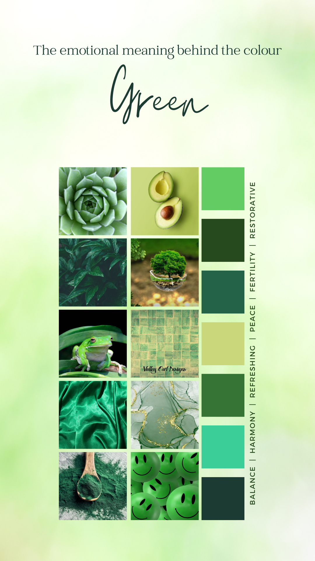
Green
Green is the ultimate life coach of colors. It's like a little slice of nature in every shade, from the soothing comfort of grass to the towering confidence of trees and the wild spirit of bushes. It's the color of relaxation, health, prosperity, hope, and a big ol' breath of fresh air. But hey, even a power player like green has its down days - it can also bring on the yawns of boredom and the blahs of stagnation.
The double-edged sword of perception! While it can be seen as a sign of success, it can also be linked to materialism, envy, and possessiveness. Tricky, isn't it?
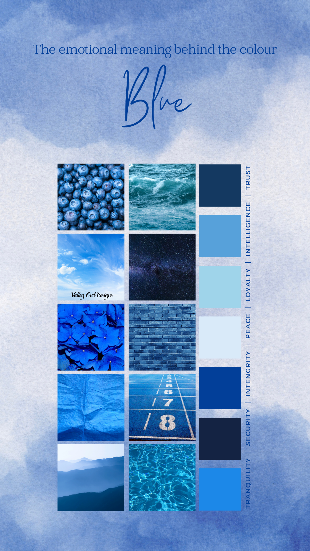
Blue
Move over, all other colors – blue is the reigning champion, with 57% of men and 35% of women putting it at the top of their list. And it seems like brands are totally on board with this trend too. No surprise there, as 33% of the top brands out there are rocking this cool and collected color in their logos.
Blue can make us feel all kinds of things, from secure and powerful to wise and trustworthy. It's no wonder social media giants like Facebook and Twitter are all about the blue vibes – after all, when you're dealing with tons of user data, you've gotta look dependable.
But don't be fooled – blue has a darker side too. It's not exactly known for its appetite-stimulating qualities, and it can give off a chilly, unwelcoming vibe. So, while blue may be the world's fave, it's got its fair share of baggage too.
I am currently delving into the fascinating world of color psychology on my business page. If you are interested in discovering what your favorite color says about you, be sure to follow my page for all the insights and information! Join me as we explore the intriguing connections between color and human emotions, behavior, and perceptions. Follow along and let's unlock the secrets of color together!
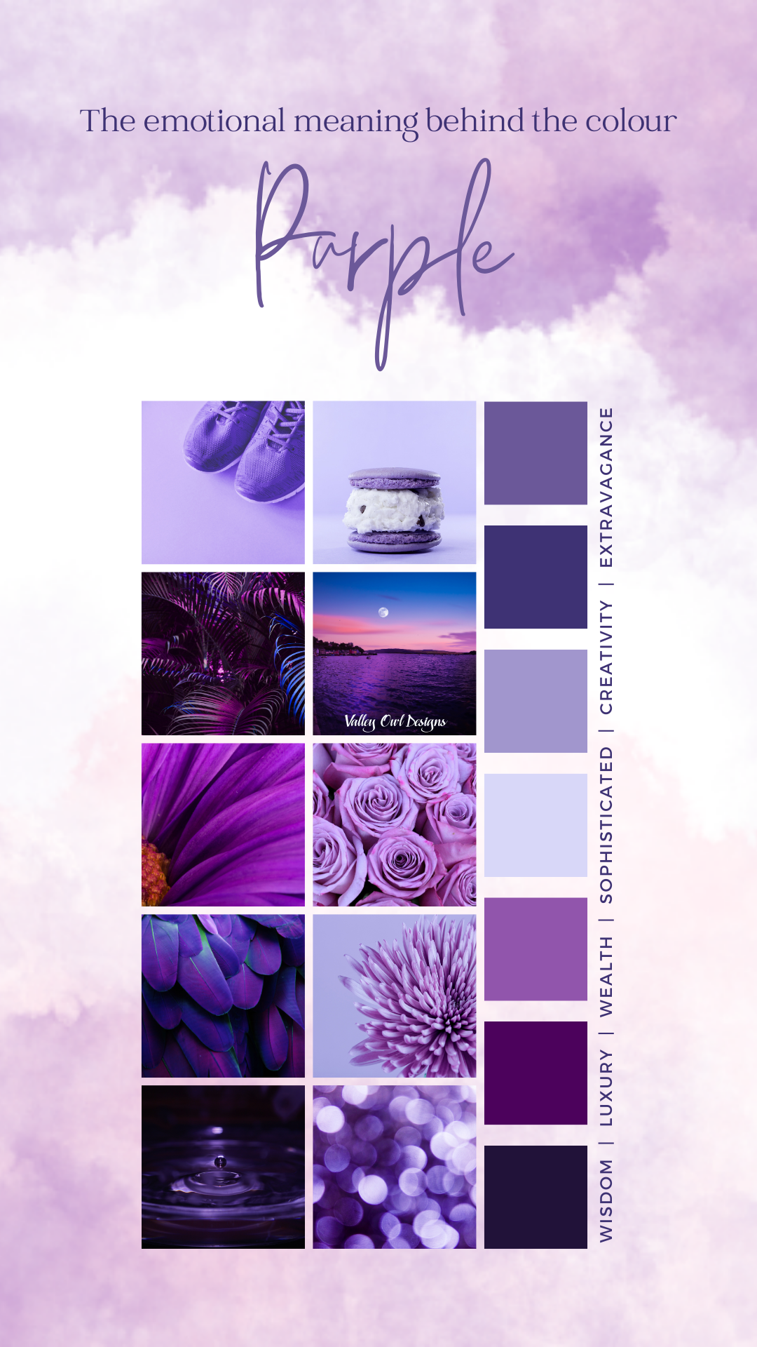
Purple
Purple isn't just a color, it's a statement. Back in the day, rocking that regal shade meant you were high society - it was even pricier than gold! Queen Elizabeth I was so possessive of purple, she banned commoners from wearing it. Talk about a power move, right?
Today, purple still carries that air of wisdom and wealth. Brands can use it to say, "Hey, we're top-notch!" But watch out, because too much purple can also scream, "I'm extra and moody." So, when using this majestic hue, remember: moderation is key.
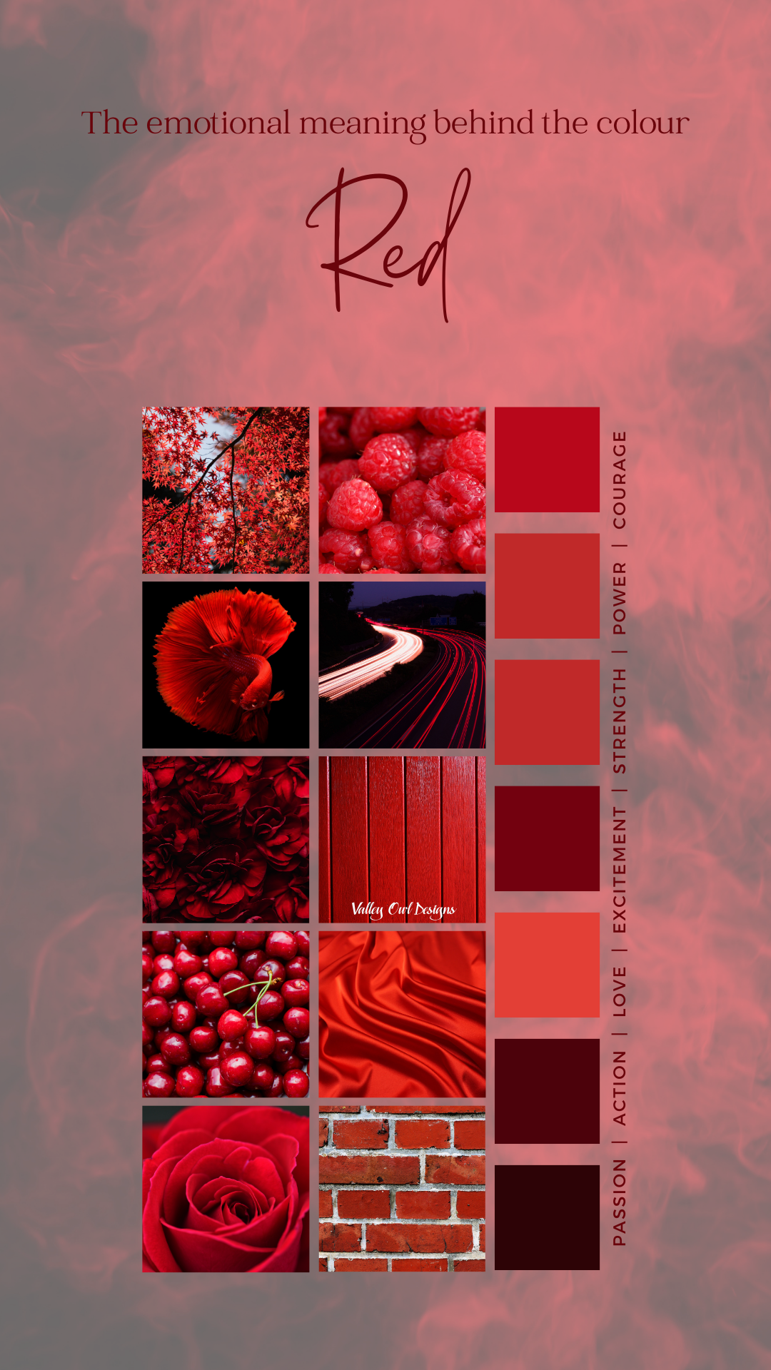
Red
Red is a force to be reckoned with. It's the color of excitement, energy, and power. It's the kind of hue that makes you stop and pay attention. Sales calls-to-action buttons love to use red to light a fire under shoppers' feet, because it screams urgency. Plus, it's been known to make people hungry, so there's that.
But watch out, red isn't all sunshine and roses. It's also the color of anger, warnings, and danger. It's the reason why police lights and stop signs are so darn effective. And if you saw Disney's Inside Out, you know that anger is represented as a fiery red creature. So, while red can definitely make a bold statement in branding, you've got to use it wisely.
Red can promote so many emotions it is not a colour you want to mess with
Orange
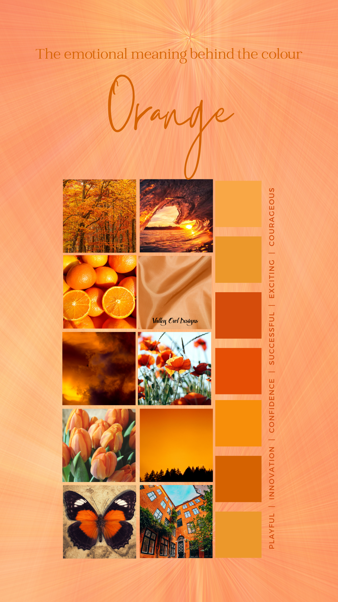
Orange - the color that screams, 'I'm confident, creative, and courageous!' It's the go-to choice for brands that refuse to be boring and want to make a bold statement. Plus, who can resist the warm, playful vibes it brings, like a ray of sunshine on a summer day? But beware, this cheeky color has a darker side too. It might stir up feelings of frustration or make you seem a bit, well, immature, but when used in the right way, it can bring a sense of energy and excitement.
Surprisingly, 29% of folks even say it's their least favorite color. Can you believe it? Despite its polarizing nature, there's no denying the impact and personality that orange brings to the table. Whether you love it or loathe it, one thing is for sure - orange is a color that demands attention and leaves a lasting impression.
Yellow
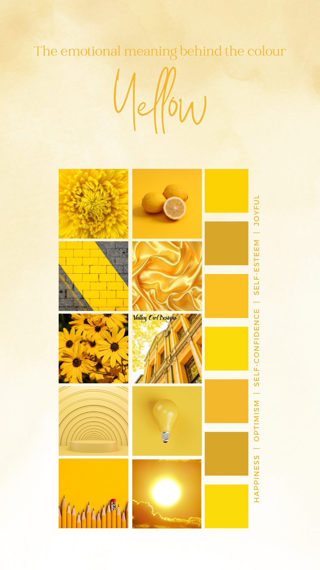
Step aside, orange – it's time for yellow to take center stage and embody all things youthful and cheerful. This vibrant hue is the epitome of happiness, represented by grinning emojis, vibrant sunflowers, and those adorable rubber ducks. As brands eagerly join the yellow bandwagon, they seek to capture the optimistic, creative, outgoing, and warm vibe that this color exudes.
However, it's important to note that yellow branding may evoke unexpected emotions. Beyond its sunny disposition, yellow can also prompt feelings of fear, irrationality, and anxiety. Just consider the cautionary associations of police tape, traffic lights, and street signs, all adorned with the very same yellow hue. So, before you embark on a yellow branding journey, it's essential to acknowledge and embrace the multifaceted nature of this color.
Black
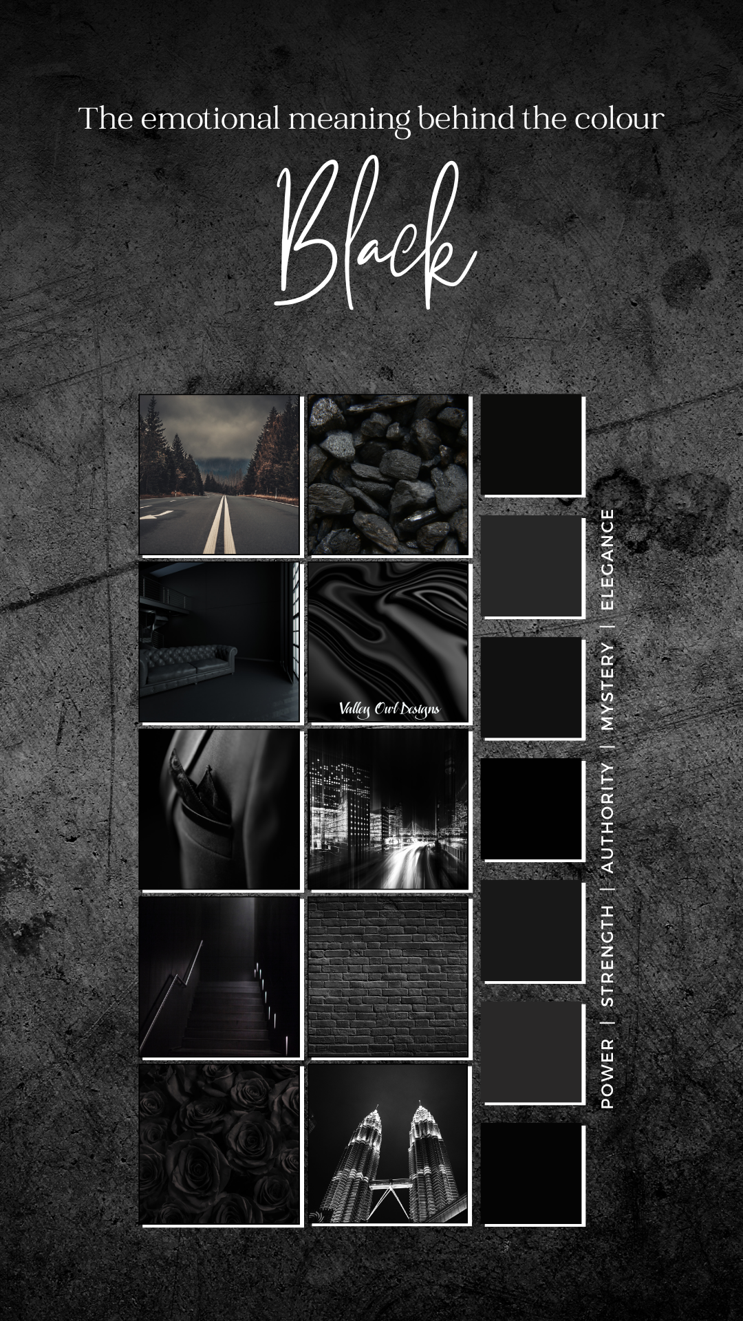
Black is everywhere, from websites and emails to logos. It's the go-to color for brands that want to ooze sophistication, power, and elegance. Luxury companies love black like a fashionista loves her Louboutins. And did you know? About 3 in 10 high-tech companies are also hooked on black for their logos.
But wait, there's more to black than meets the eye. It's not all glamour and power. Some people see black as the color of oppression and coldness. It can even be associated with evil – just ask Ursula the Sea Witch or Scar from The Lion King. (hashtag disney)
While black is the fashion industry's BFF, it's not always a hit elsewhere. In the health industry, for instance, black is about as rare as a unicorn sighting. Why? Because it gives off serious vibes of death and mourning. So, next time you're picking a color, remember that black is more than just a little black dress – it's a whole mood.
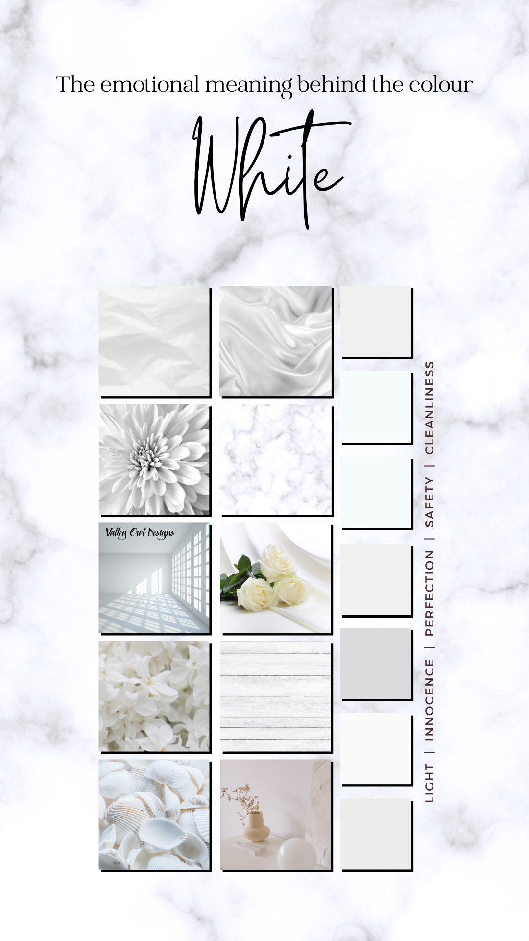
White
If your business is aiming to exude a sleek and simple aesthetic, then white is undoubtedly the color of choice. When paired with black, it establishes a modern and sophisticated ambiance, embodying purity, innocence, and a pristine appearance.
However, it's important to exercise caution, as an excessive use of white could inadvertently evoke a clinical or sterile atmosphere. To avoid appearing bland or uninspired, consider incorporating pops of vibrant color to infuse energy and personality into your brand.
After all, every color thrives within its own unique context. Just consider the iconic white logos which have come to symbolize cutting-edge innovation and timeless elegance.
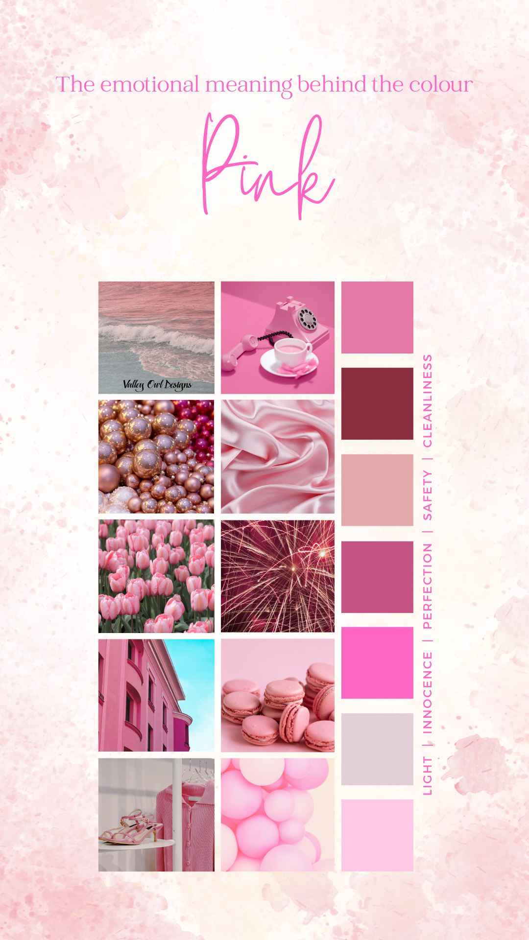
Pink
Pink is undeniably the most popular color to symbolize femininity, and its versatile appeal makes it a great choice for any brand looking to convey a youthful, imaginative, and quirky vibe. T-Mobile, for instance, successfully leverages its distinctive magenta coloring to set itself apart from competitors and create a strong visual identity.
However, it's important to note that pink can also evoke feelings of childishness or rebellion. Over time, the initial allure of pink may diminish as consumers become accustomed to its presence. For instance, a visit to a Victoria’s Secret store can leave one feeling overwhelmed by the abundance of rosy walls.
Despite its potential drawbacks, pink remains a powerful and impactful color choice for brands seeking to make a memorable and lasting impression.
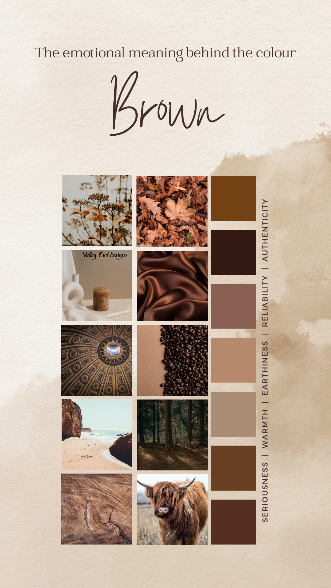
Brown
Brown, the color of resilience and earthy vibes. It's like a warm hug from the planet itself, reminding us of the important things in life – home, family, and our roots. Who knew a color could be so deep, right? It's all about appreciating the simple pleasures and finding comfort in the everyday.
Luxury? Nah, brown keeps it real with the basics. It's the OG of natural colors, bringing that cozy warmth we all crave. Dark shades channel those woodsy vibes, while the lighter ones are all about that earthy connection.
Sure, brown may not be the flashy type, but it's cool with blending in. It's the strong, silent type that never loses its grounding. Brown – the unsung hero of the color wheel.
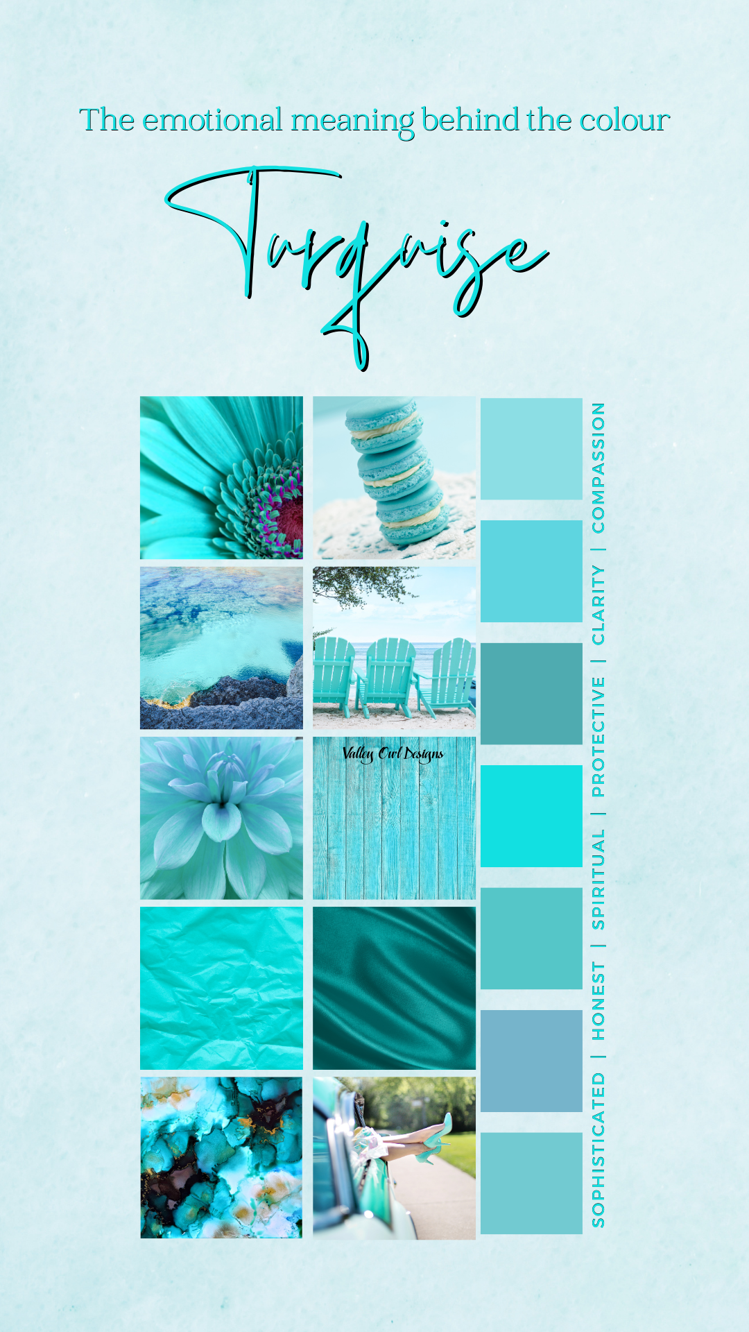
Turquoise
Alright, let's talk about turquoise - the unsung hero of the color wheel. This bad boy is a blend of blue, green, and a splash of yellow, giving it a whole smorgasbord of vibes. It's got the calm and collected nature of blue, the balance and growth of green, and a little pop of yellow for that extra pizzazz.
Turquoise is all about sparking inspiration, fostering innovation, and unleashing creativity. It's like a breath of fresh air, bringing clarity and efficiency to the table. Plus, it's the ultimate communicator and has a knack for soothing the soul. No wonder it's a go-to for all things Mind, Body, and Spirit.
But hey, every superhero has its kryptonite, right? Turquoise can sometimes come off as a bit aloof or unreliable, and it might even give off a whiff of boastfulness. So, like any diva, it needs to be handled with care.
